
Value in a drawing means the range of tones from dark to light, essentially from black to white. Adding value to a drawing gives it dimension, expresses light, defines form, and even provides atmosphere. Generally, what is lightest is light because it receives the most light – sun or artificial light; and what is darkest is because there is an absence of light. Look around you. See if you think this is true. Right now I’m looking out the window at the trees and bushes. The lightest spots are directly hit by the sun. The darkest spots I see are underneath the plants and trees where foliage and tree trunks block the light, and in between is an infinite range mid-tones or values.
On the floor a shaft of light moves across the living room, hitting a chair and a section of rug. Those highlighted areas would appear nearly white in a black and white photograph. So the first thing important thing I want you to know about a value drawing is, that like line drawing, a value drawing depends upon what you see. It’s really not a mystery at all. Simply look for lights and darks and you will begin to see things you never saw before. Pretty cool, huh?
A very good first step in learning to draw values is to make a value scale. Using a pencil, it’s easy to make boxes of gray that get lighter as they move from black to white. A pencil is dark or light depending up how hard you press when drawing. With a feather light touch one can make a lovely soft gray, pushing harder, a deep charcoal gray.

How do accomplish the same task with a pen? It’s all about how much white is in between the pen strokes. For very dark gray, there will be very little white paper showing through. For the lightest grays, only a few pen strokes.
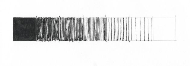
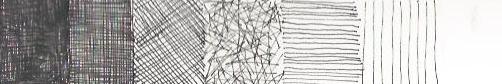
With both pencil or pen your technique in creating a square of gray is up to you. With a pen you can cross-hatch, scribble, use vertical lines(my usual method) or even dots. Here is an example of a seven step value scale using different lines and hatching methods.
To make one yourself, I recommend drawing seven small squares – not larger than one inch square. Make one square on the end as black as you possibly can with your pencil or pen. Leave the square on the other end blank. Next, work on the middle square. Make it a halfway gray between black and white. So far so good? Then tackle the darker two square and make them even steps between black and the half way gray. Finally, the lighter two boxes – even steps to white. Good job, you’ve done it!
Next week we’ll talk about how to use those value scales.
