
After the very small thumbnail sketches to plan how I will compose a scene, it’s time to begin the actual drawing. I’m going to be working on an 8″ x 10″ piece of 140 lb hot press watercolor paper. Arches is my brand of choice. I love the way the ink from my pigma micron pen and my watercolors flow effortlessly across this surface.
Before the ink and watercolor arrive on the scene, I lay out the design on the paper. For this I use an HB pencil and lightly draw the large shapes. This gives me a road map for my vertical lines. I know some people just jump in with a pen, but I find I have more confidence if I have a few guidelines down first. However, when I tried to take a photo of the light sketch, it was so pale the camera wouldn’t pick it up. I had to go in and darken my lines for you to see my starting point.

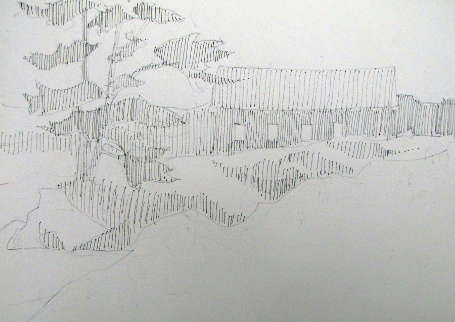
Then, I erased the dark lines and started in with ink. The first pass over a drawing is usually a “tone” of widely spaced vertical lines indicating the areas of middle and darker values. This provides a foundation on which to build the drawing. And, it helps me keep the whole scene connected. Take a look:
I make sure to draw with a light touch and widely space these lines across each major shape. If it gets too dark too soon, it’s impossible to fix. So I work up the values gradually, maintaining the balance and design. Next week I’ll start building the values. Stay tuned!

Enjoyed watching you work. Thanks!
I thorough enjoyed watching this. Thank you for sharing ! See you around this summer !
Jeannie Grisham