
The line drawing in and of itself is not bad. It’s interesting and tells the story of the place. But color can take an interesting drawing and lift it to a whole new level. There are as many ways to add color as there are artists. Experiment to find a way that you’re excited about. I used to watercolor randomly around the page. One day the idea of this wash popped into my head and I’ve been doing it ever since. I like how it adds surprise and intrigue, and best of all, it draws the viewer in close to look carefully at the scene.

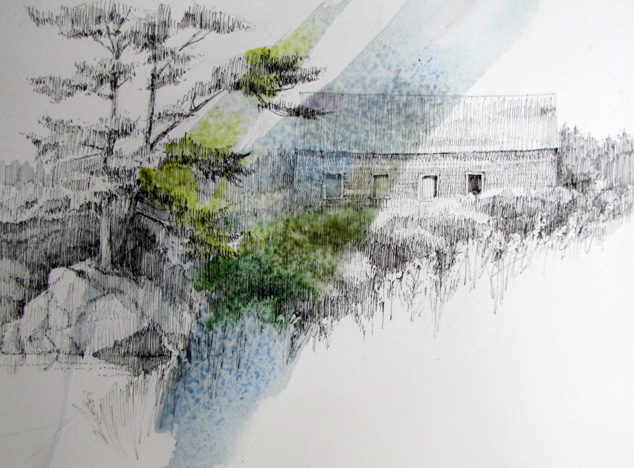
My first step is to determine where to put the wash. Sometimes the drawing will tell me a definite direction, other times it could go either way. On this drawing I think it should go from right to left because if I put it the other way it would make an “X” with the strong diagonal of the hillside. I don’t want that.
I start with a one inch flat sable brush and wash a light color over an area. Sometimes I actually start with plain water, then float colors into it. Here, I use cobalt blue and a lot of water to create a wash shape.

Next, I start floating some colors into the blue. I don’t mind that the colors run. That’s the fun of it!
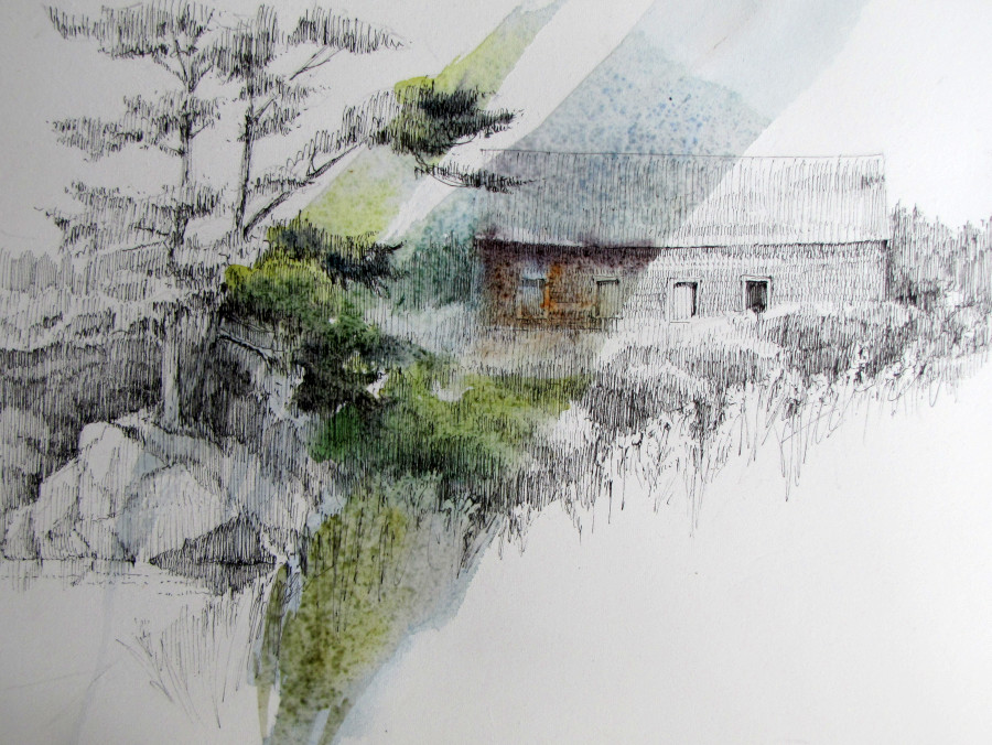
I add burnt sienna and windsor purple (I love purple) to the barn and deepen the colors on the tree with paynes gray. At this point it’s still so wet I have to let it dry a bit before going further.
As the wash dries I can go in and crisp up a few areas, like the windows and branches on the tree. I don’t want too much detail in the watercolor. Just a hint. The trick is to be a minimalist with the wash. In fact I always try to quit before I think I’m done. It is tempting to keep dabbing and adding more color. Don’t do it!
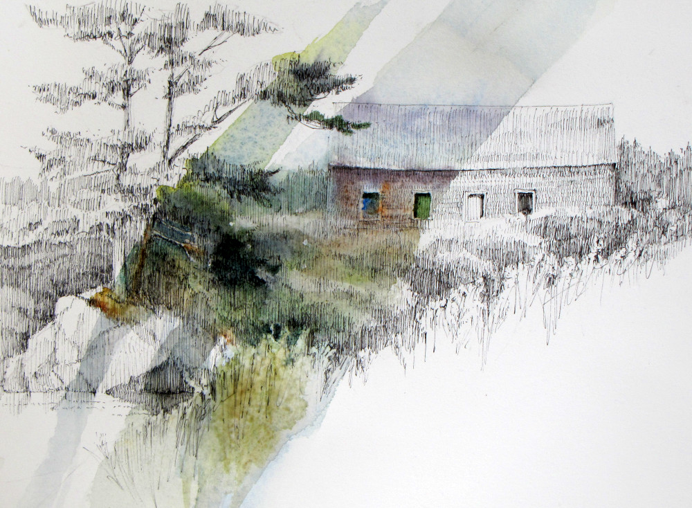
Ta-da! It’s finished. I like the way each window is different. The windows originally drew me to the scene and now the windows make an interesting focal area.

Paula, I love your truly unique way to express, with color, such gorgeous drawings!
Sheer magic!
Tina