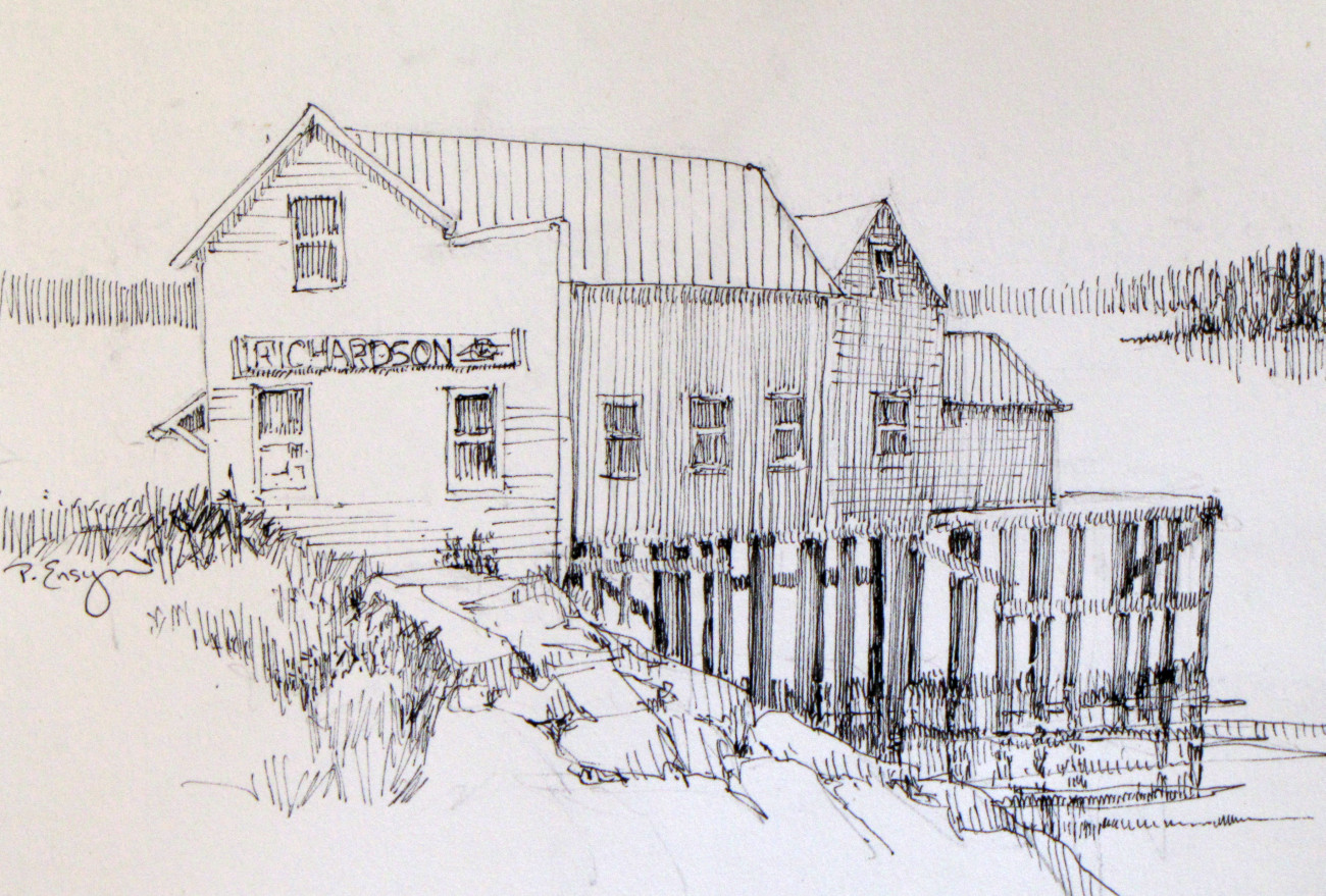
Last week I posted a very simple drawing with some major composition flaws. There are any number of ways to improve problems such as these. Here again is the “wrong” picture,

and a review of what I purposely drew wrong and how I corrected it, The “right” picture is at the bottom – and a color enhanced version in the gallery.
-The focal point is the dark window against the white siding, smack dab in the center of the page. In the right drawing, I put that side of the building in shadow and moved the area of interest and contrast to the lighted side of the building. It’s hard to tell but that side of the building is at an odd angle. It could conceivably be in the sun, while the side over the dock could be in shadow. It’s always possible to change light and shadow to support good design. Just be consistent so that light hits everything from the same angle.
– I moved the building down so that the roof peak wouldn’t end on the edge of the paper.
– On the “wrong” version, the pilings are evenly spaced – boring! – not to mention the fact that they don’t indicate the depth of the dock. The improved version has a much more interesting arrangement of shapes and creates a sense of space.
– The island in the background has two Mike and Ike trees. It’s floating in space and is unconnected to the rest of the picture. I made the shape of the island less defined and added a bit of land beyond that which ties the elements of the drawing together.
– In the foreground, the line of the rocks is regular and makes a beeline for the bottom right corner moving your eye straight off the page. Drawing the rocks at a different angle is a big improvement. Adding a bit of shading to define the shapes helps too.
-Also in the foreground, instead of evenly spaced lines for grasses and ground cover, I varied the values and form. This not only is more interesting, it’s more natural.
The changes I made are not huge, but all together, they make a much more harmonious drawing.